
Monorail
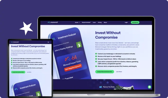
Monorail is a digital new financial technology platform that is an on-demand, user-friendly web and mobile experience that provides an easy-to-use way to conduct all aspects of financial operations and create a seamless digital interface for its consumers. The Monorail platform has been designed as a way to provide businesses with effective, scalable, and highly usable solutions to help organizations manage their financial workflow and to do business.
As Monorail’s partner, we were able to help them enhance their Webflow website, improve the overall user experience, and create a more effectively structured digital platform. Our overall goals were to create a clearer understanding of the products/services, foster greater interaction with the user, and create the potential for continued scalable growth.
Business Challenges
Monorail has a solid product foundation, but requires enhancements in the structure, performance, and user interaction of its existing Webflow site to improve the probability that users will convert into users. Monorail also lacks a cohesive Design System, requires an optimized flow throughout the site, and needs to organize its content in an effective manner.
- Complex Page Structure: Monorail’s web pages consist of multiple-layered sections and associated layouts that lack cohesiveness in their design, and there is no clear organization to the structure of how the different sections of the web page logically relate to each other.
- Inconsistent Design System: Many different design elements are present on the web workflow, from varying typefaces and spacing to using different design components. This creates an inconsistency and affects a visually coherent and consistent professional brand experience throughout the web workflow very difficult to accomplish.
- Weak Conversion Flow: Visitors were not clearly directed from the web pages to perform the important actions. There were no structured paths or effective call-to-action locations, resulting in a missed opportunity to convert a visitor into a user.
- Static User Experience: The web pages primarily used static content, rather than using interactive or dynamic content types. By using primarily static content, users were less likely to engage with the content, making it less likely to capture their attention or communicate the value of the platform.
- Low Engagement Sections: Poor presentation of content and visual hierarchy in many sections resulted in a decrease in the time required for a visitor to stay on the site, and resulted in less exploration of product features and benefits.
Solutions
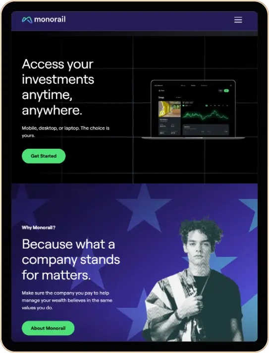
We have restructured Monorail’s site in Webflow to improve the clarity, consistency, and level of interaction with users. We have emphasized creating a scalable design system, improving performance, and creating a more intuitive and conversion-driving user experience.
- Structured Page Architecture: We reorganized the way pages on the site are currently arranged to have a clear and logical arrangement based on how pages should be arranged, improving the navigation and content hierarchy on the pages. Users should now be able to more easily discover product features and how they fit into the platform.
- Unified Design System: Adoption of a unified design system, applying typography, spacing, and reusable components consistently across all pages. Resulted in improved visual consistency and faster and easier management of future changes.
- Optimized Conversion Flow: Redesigned user journey with strategically placed calls to action and improved paths. We improved the ability of users to be directed toward taking key actions, which has led to increased user interaction and improved user conversion rates across all areas of the platform.
- Interactive User Experience: All static areas were made dynamic and included additional interaction/completed areas throughout. Increased user engagement, time spent on the website, and a more efficient expression of how the platform works for users in tangible ways.
- Engaging Content Sections: We improved the overall presentation of the content by creating an improved visual hierarchy, providing users with an accessible organization, and clear messaging. As a result, users engage longer with the website by providing them with the ability to easily continue navigating through the website and to learn more about how their products provide value.

Let’s build scalable Webflow experiences together.

Project in Figures

Applied Technologies
Webflow

More Screens


