Starship Hospital
Starship Hospital is the national children’s hospital in New Zealand, serving patients, families, and health professionals, as well as supporting campaigns such as Power to Protect. The long-term challenge was to adjust the levels of clarity, consistency, and scalability to suit various audiences and work environments.
In addition to functionality, the hospital was interested in the site portraying its mission, providing care, guidance, and trust to families in stressful times. It required the platform to be an information center and a caring online friend, which needed to be accessible, reliable, and trustworthy at all levels of interaction.
Business Challenges
The platform used by Starship Hospital was accessible to many audiences, but it lacked straightforward navigation and uniformity. There was considerable confusion and time wasted among families, patients, and professionals in locating essential information, necessitating the need to overcome these obstacles to make it easier and more reliable to use.
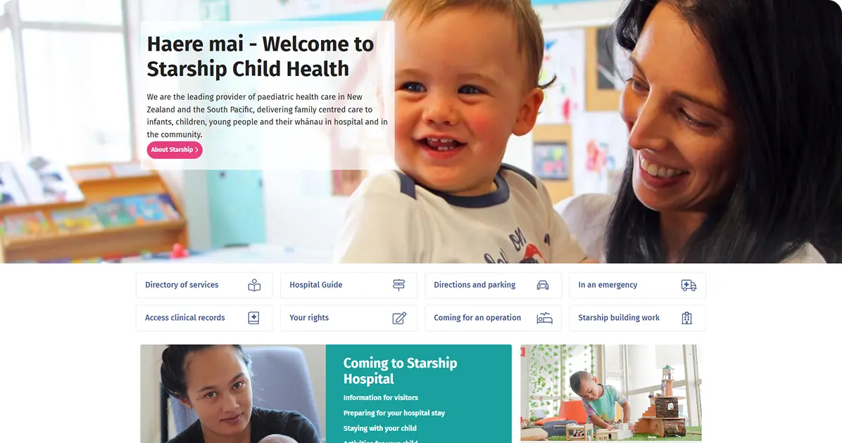
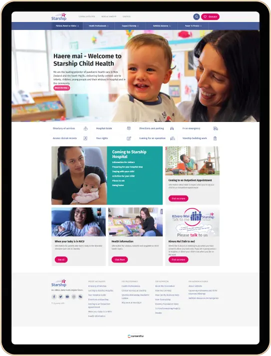
- Cluttered Homepage Layout: The homepage used to combine priorities, including the patient guide, inpatient logistics, professional updates, and a donation prompt, in both hero and grid sections, which overwhelmed families in need of instant answers and buried primary tasks such as directions, emergency contacts, and appointment information.
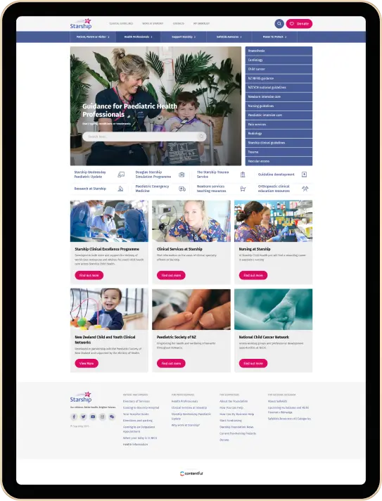
- Confusing Audience Navigation: Several audiences used the site, but the paths were overlapping: family resources were listed alongside clinician instructions, campaign materials were generated in the middle of care activities, and users had to second-guess where to go to reach the right place, and before performing a task again.
- Inconsistent Page Design: Patients and Families, Health Professionals, and Power to Protect pages had different design languages; typography, card styles, and spacing shifted, disrupting recognition, adding cognitive load, and making repeat visits seem like different and unfamiliar websites.
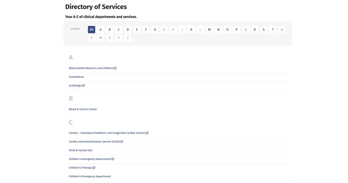
- Weak Search Experience: Search and discovery did not work well: category names were general, filters were limited, and deep content, such as clinical guidelines or outpatient instructions, could usually require more than one hop between tiles, menus, or subpages to locate reliably.
- Scattered Action Points: The most vital actions, including reaching out to help, donations, reading rights, or emergency directions, were shared on different modules and footers, which weakened the intent signals and delayed conversion at some point when the family needed a calm reassurance or a sense of direction.
Solutions
We reorganized the information hierarchy, established clear audience routes, consolidated the visual hierarchy, improved search and taxonomy, and focused on high-intent actions. These enhancements, combined, help reduce friction, enhance findability, and provide a consistent and relaxing healthcare experience.
- Simplified Homepage Structure: We streamline the home page hierarchy by moving core hospital activities, directions, emergencies, appointments, and service directories to the forefront, and campaigns and donations to secondary areas, minimizing distractions and providing families with essential information at a glance.
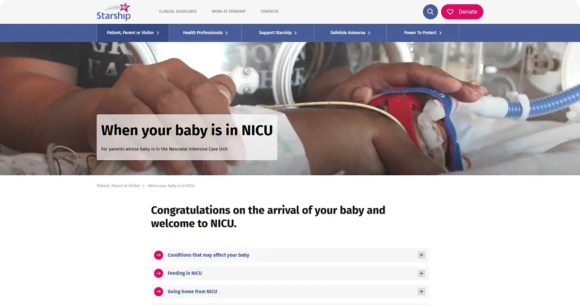
- Clear Audience Pathways: With separate audience paths, specific menus, landing pages, and contextual links, we ensure that families, patients, and clinicians find themselves on purpose-built content that does not overlap with other content, which helps decrease decision friction and queries about where specific resources belong.
- Consistent Design System: We utilize a set of unified designs to create a sense of connection, reduce cognitive load, and foster trust through predictable and repeatable interface behaviors. Patients and Families, Health Professionals, and campaign microsites all feature consistent typography, spacing, card patterns, and image ratios.
- Smarter Search & Filters: We enhance search with better taxonomy, auto-suggest, and filters, and reorganize content to bring surface-level materials, such as clinical guidelines and outpatient instructions, to the bottom of the results, two clicks deep, allowing users to find information precisely on the home page, section hubs, or result pages.
- Centralized Engagement Actions: We centralize actions to engage in persistent, high-contrast CTAs, including contact, donation, emergency, and rights, visible in all templates and footers, to align analytics events with intent, convert more rapidly, and offer immediate reassurance to families, particularly in stressful, time-sensitive circumstances.
Transform your healthcare website. Talk to Our Experts Today!

Project in Figures
Applied Technologies
React
More Screens