Genki Greens
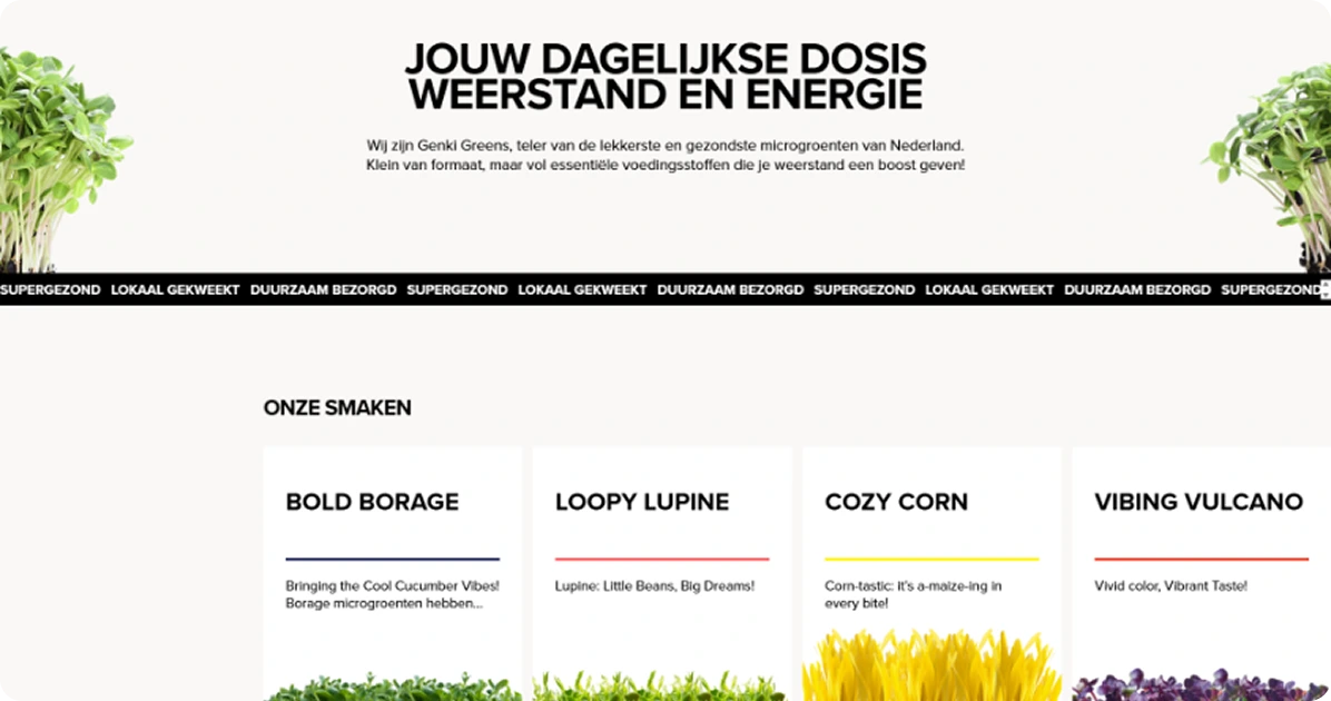
Genki Greens is an innovative urban farm located in the Netherlands. They provide nutrient-rich micrograins to conscious consumers, restaurants and wellness enthusiasts. Their approach blends innovation, freshness and environmental responsibility, grown locally, cut on extreme freshness, and packed with taste, flavour and nutrition.
With the increasing demand for durable, locally sourced food, Genki Greens required a digital appearance that could express their mission, educate their audiences and streamline the customer engagement. Pennine team collaborated with them to prepare a clean, modern and conversion-centred website, which is beyond a specific brochure site.
Business Challenges
Genki Greens is a Netherlands-based urban agricultural company specializes in fresh, biological micrograins. They want to promote healthy, sustainable agriculture and supply nutrient-filled greens at the doorstep. The challenge was to design a website that was not only visually attractive but also scalable, SEO-friendly, and aligned with its mission-operated brand.
- Awareness and trust-making: Micrograins are still a niche product; one of the greatest challenges was building awareness. The website had to communicate credibility, scientific benefits, and brand story in a way that was both informative and relatable.
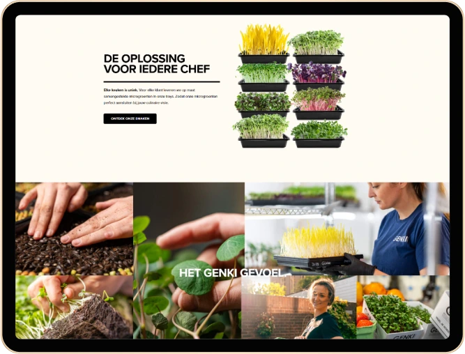
- Storytelling Through Design: Genki Greens design template could not capture the freshness and authenticity of the brand. The website needed to feel natural and alive in a way to promote farming practices and a healthy lifestyle instead of stock visuals.
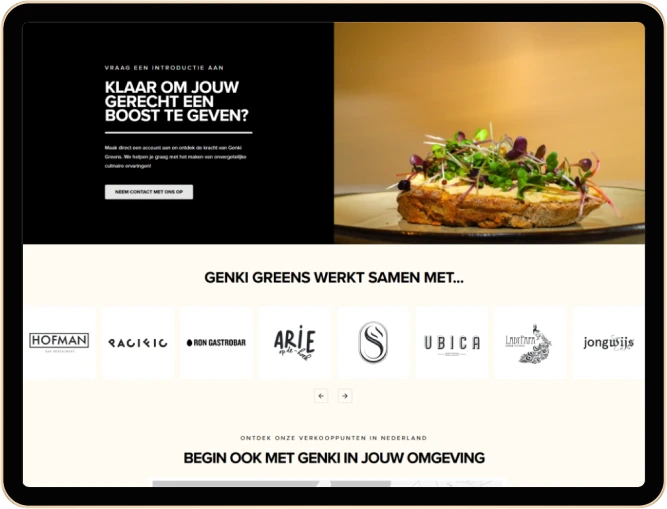
- Target: Genki Greens serves a mixed audience of individual health-conscious buyers, chefs, restaurants and welfare businesses. The challenge was to talk to all these groups through the same platform, using fragmented flows, target messages, and a clear CTA.
- Long-term Scalability: The team had a plan to introduce membership, a webshop and educational content. The website must be modular and flexible to grow with the business, to allow new features and content redesign. It requires thoughtful development options and scalable architecture from the beginning.
- Dutch language adaptation: Because their primary audiences are Dutch-based, the website required native language content, culturally familiar design patterns and targeted to Dutch keywords. The localization was to be done without compromising a responsive, visually operated brand identity that could also attract international interest in the form of brand scale.

Solutions
Our website solutions helped position Genki Greens as a trusted and modern health brand. It functions as both a digital storefront and a storytelling platform.
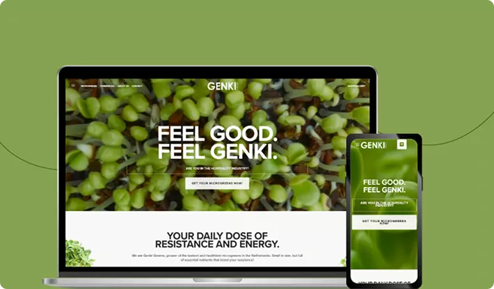
- Authentic Brand Experience: We developed a clean and minimal website using brand colours, typography and custom imagery. This expressed the freshness of greens and the authenticity of the farm. Each element was designed to enhance brand perception and emotional relations with health-conscious visitors and environment-minded professionals.
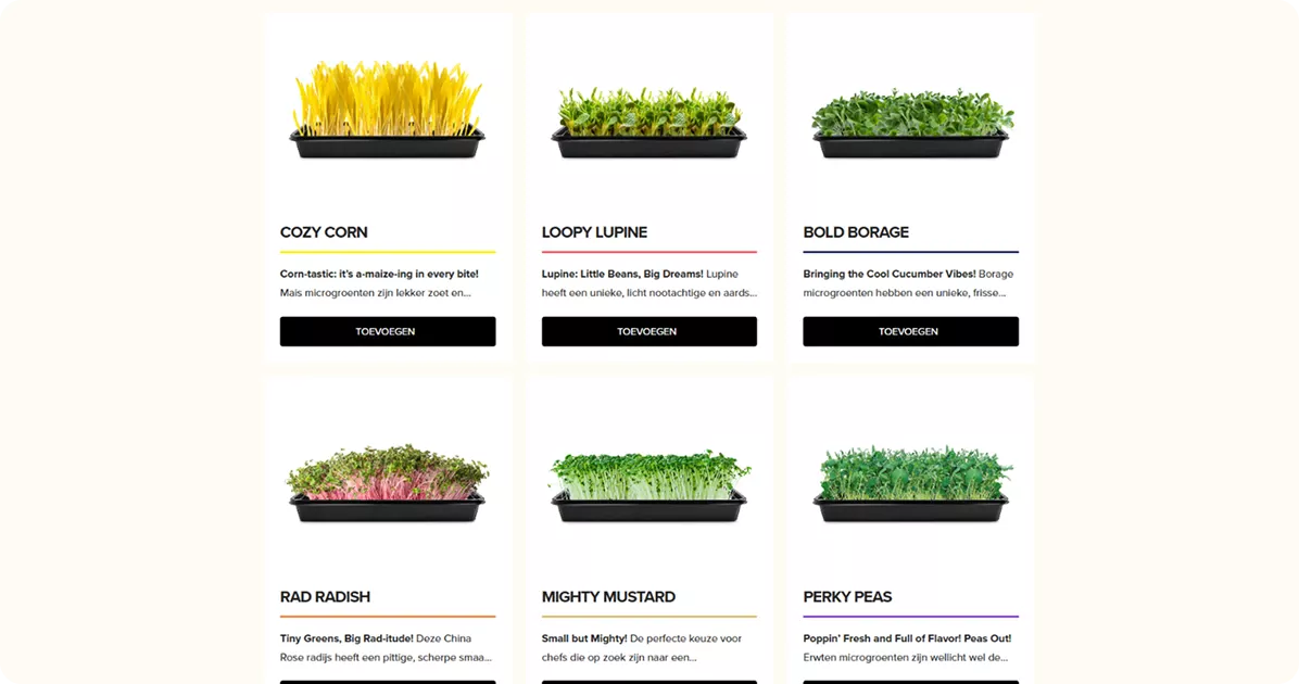
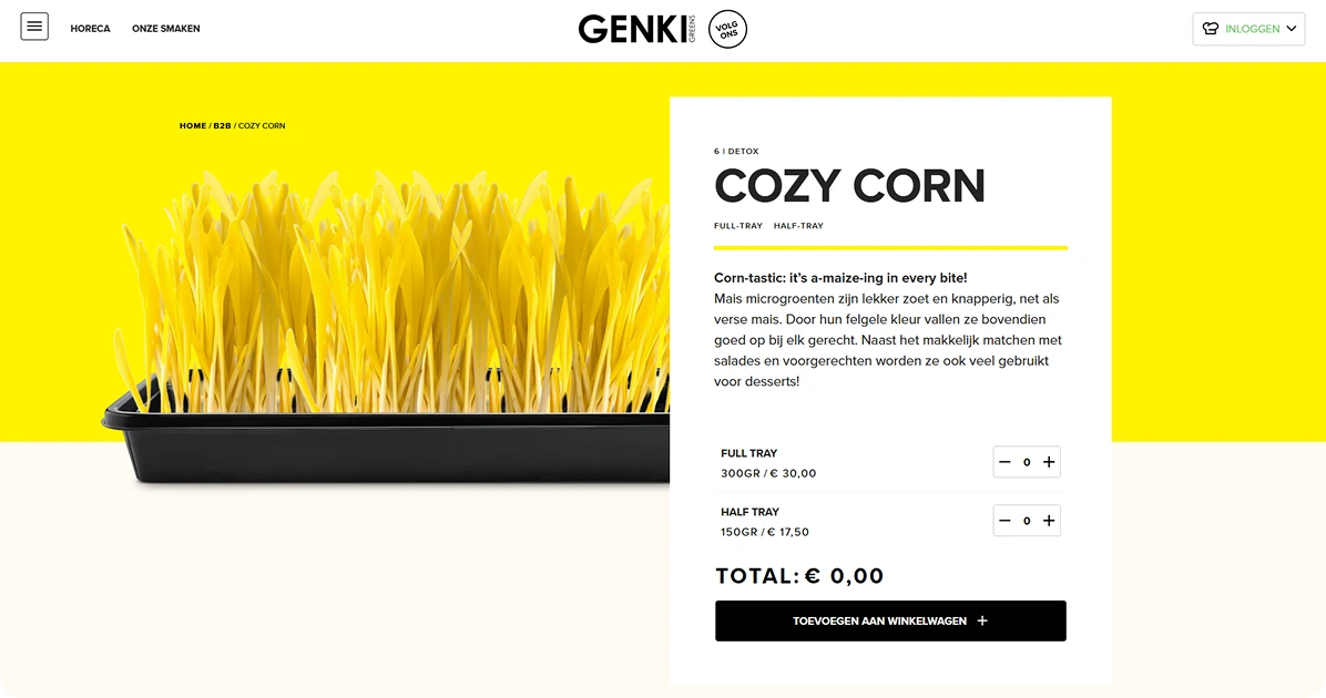
- Educational user flow: To make microgreens accessible and interesting, we designed interactive material sections, explaining their health benefits, how they are grown, and use them. These bite-shaped educational contents made the material easy to digest, helping users to understand the value of the product with complex information or scientific words.
- Segmented navigation and CTAs: We applied clear, audience-specific paths throughout the website. Consumers, restaurants and wellness brands were their entry points with messages and tasks to suit each. This fragmented navigation improved relevance, guided users more efficiently, and enhanced lead generation through the targeted forms and inquiries button.
- Modular, Scalable Backand: We developed a flexible layout that allows the Genki Greens team to easily add new sections, admirers, products, or blog content without developer support. This ensures that they can expand their offerings and enter new digital stages.
- Local SEO Implemented: We developed the website for the Dutch-language SEO, including metadata, titles and material structure. The tone and phrase were designed to resonate with the local audience, while universal design sensitivity was also maintained. This helped improve their discovery visibility in the Netherlands without separating future global visitors.

Looking to Build a Purpose-Driven Website Like This?

Project in Figures
Applied Technologies
PHP
HTML5
WordPress
More Screens